

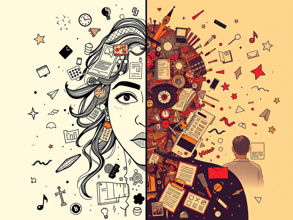
Somewhere along the way, visuals picked up a reputation for being “extra.” A sweetener. A bonus if you’ve got time. But let’s just say it: they deserve better.
Because visuals? They’re more than just nice. They’re functional. Emotional. Strategic. And in the kinds of work you’re building, the ones grounded in care, accessibility, and clarity, visuals carry meaning that plain text sometimes can’t.
Let’s unpack that.
What Counts as a “Visual” (Spoiler: More Than You Think)
You don’t need to be a designer. You don’t need fancy tools. Visuals show up in simple, grounded ways:
- A hand-drawn loop showing how a reflection practice cycles back on itself
- A layout that gently walks the reader through sections instead of racing them through walls of text
- A few lines that break and breathe like a poem
- A grid that sorts tools by mood, tone, or user need
- A printable worksheet with space that feels deliberate, not crammed
If it helps the reader see or feel something more clearly? It’s a visual. If it changes how the idea lands? It’s part of the work.
What Visuals Actually Do (That Text Alone Might Struggle With)
- Simplify complex thinking without flattening it
- Create breathing room inside heavy content
- Whisper tone before a word is read
- Allow emotion to quietly surface through layout
- Invite participation; some people need more than paragraph after paragraph
In short: visuals are allies of understanding. And if your goal is thoughtful communication, they’re non-negotiable.
Your Values Show Up in Your Design Choices
How does your visual language reflect care?
- Use wide margins, light spacing, and quiet headers → invites calm
- Use bold lines, clear sections, intentional grids → evokes structure and integrity
- Use rhythm in layout, consistent breaks, quiet pauses → signals that this wasn’t rushed
- Use asymmetry or unconventional formats → shows creativity and freedom
Visuals become your values in motion. You’re not just saying “this matters”; you’re showing how it matters.
Start Small, Stay Intentional
Here’s how to play with visuals even if you don’t feel “visual”:
- Sketch your idea before you write it. Does it loop, climb, branch, or rest?
- Try shifting your layout: What happens if it’s centred vs left-aligned?
- Use lines and spacing to slow the reader down or energise them
- Draft a table or diagram to sort the mess before explaining it
- Think: how would this idea feel if it had a shape?
You’re brilliant at building frameworks; visuals are just another format for doing it with empathy and clarity.
And Let’s Talk Printables…
Printable versions of Gwenin posts especially benefit from intentional visuals. Why?
- They’re tactile — visual rhythm makes them more usable
- They’re offline — clarity in layout matters more than ever
- They’re held — literally, so your design needs to breathe
From minimalist outlines to styled layouts with blocks and highlights, visuals guide readers into interaction, not just observation.